Client: Hudson Sandler
Location: Farringdon, London
Category: Workplace
Completed: 2018
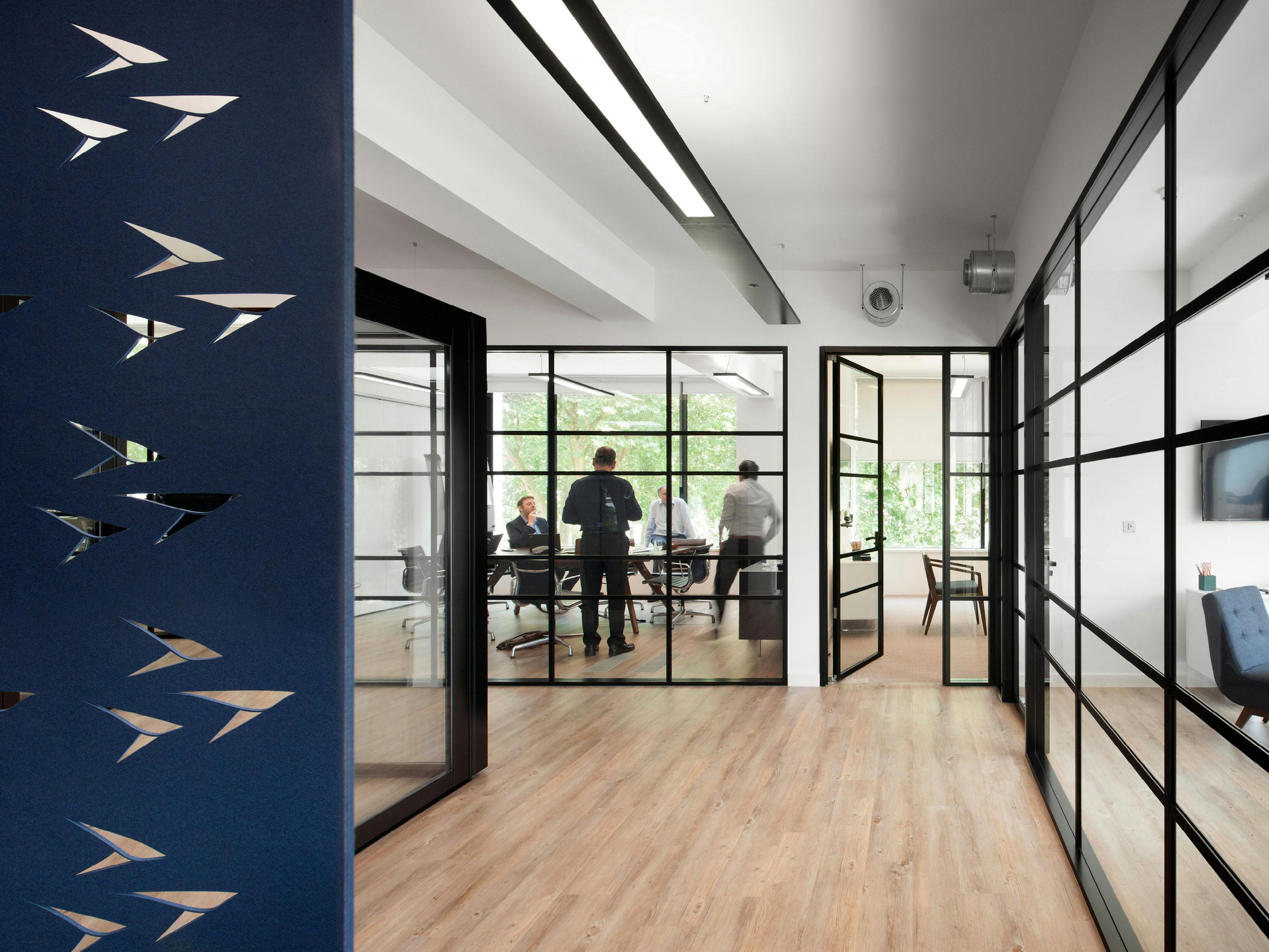
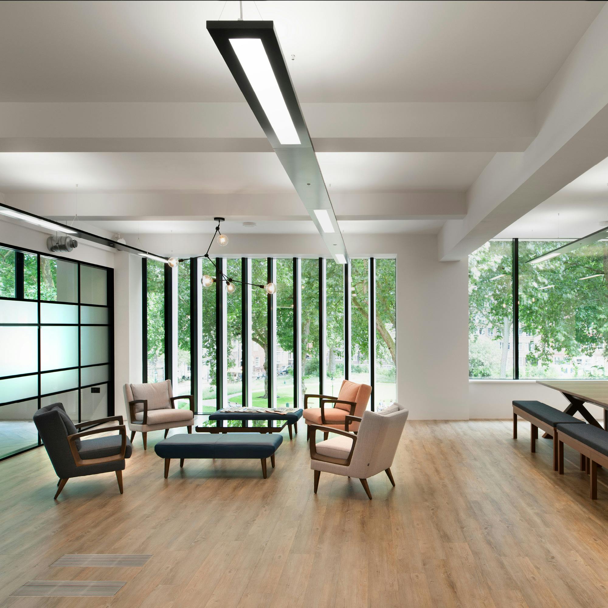
The company had just completed a major rebranding exercise and the partners wanted their new offices to reflect this change by providing exceptionally flexible, welcoming and progressive workspaces for their team. They also wanted the design to maximise the natural light and the leafy views across the Square.
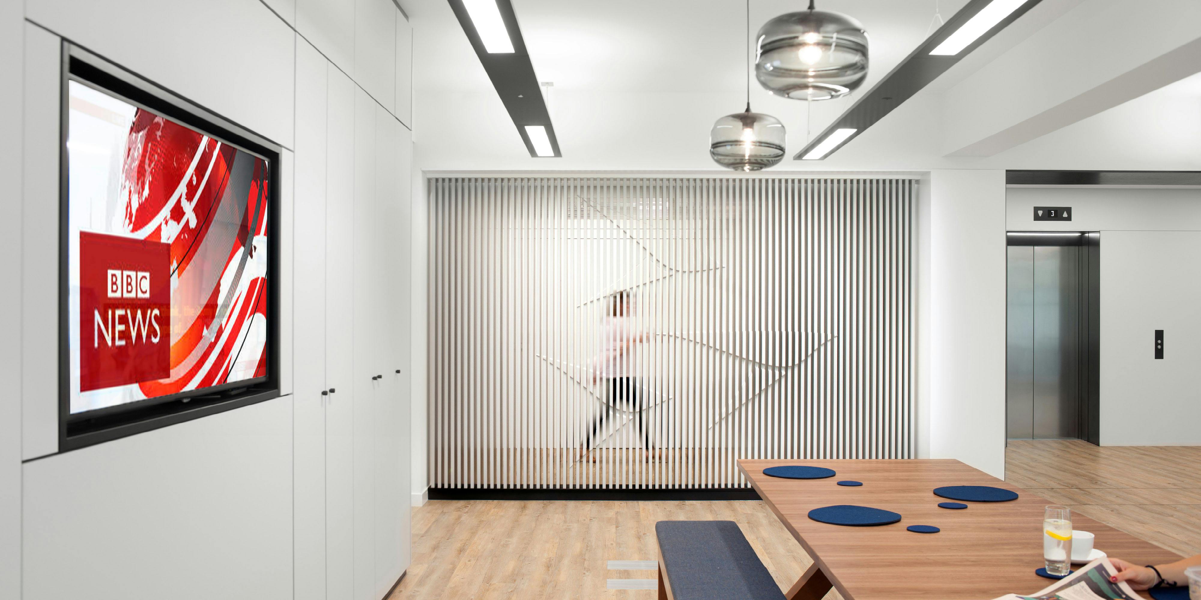
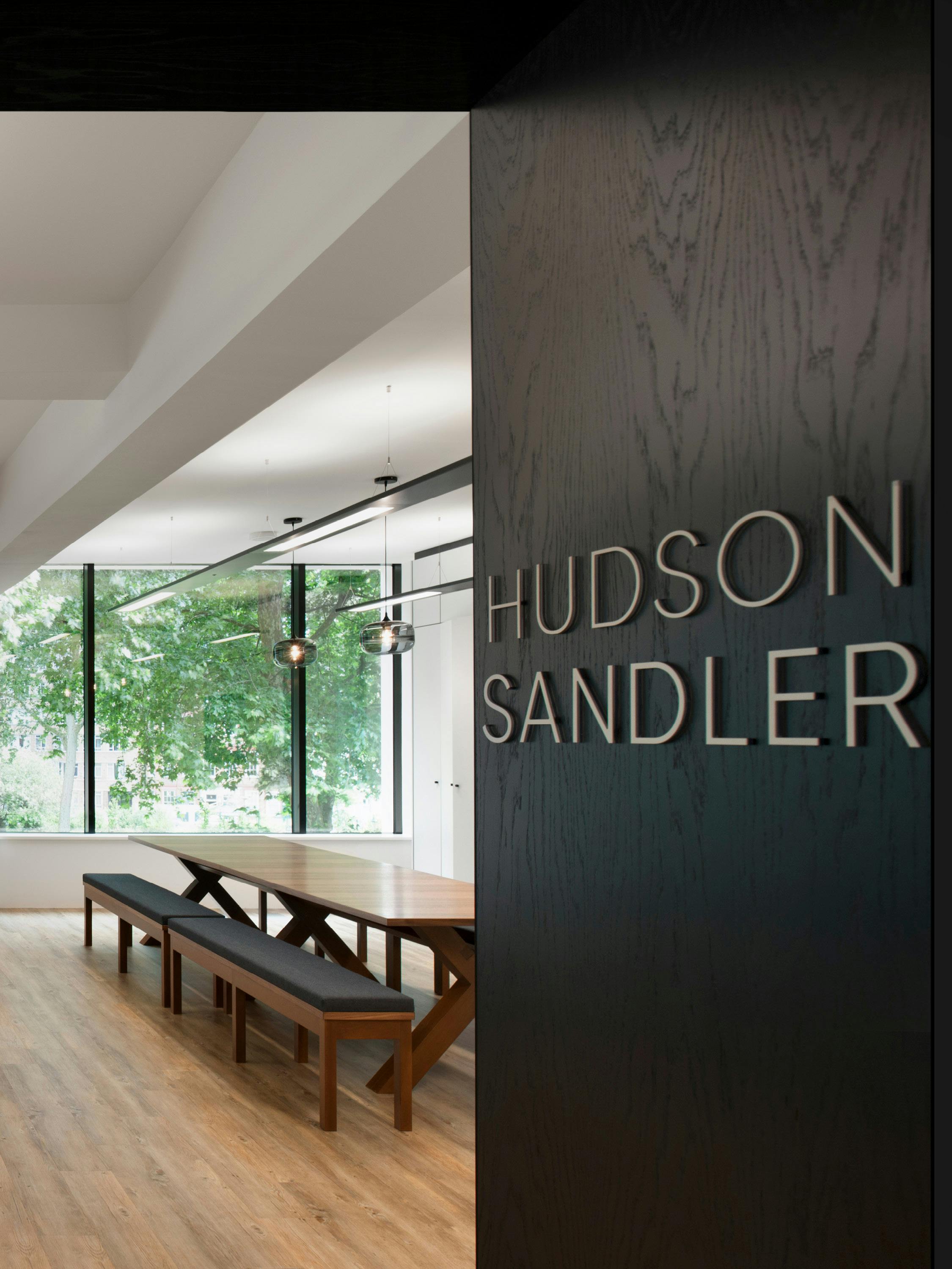
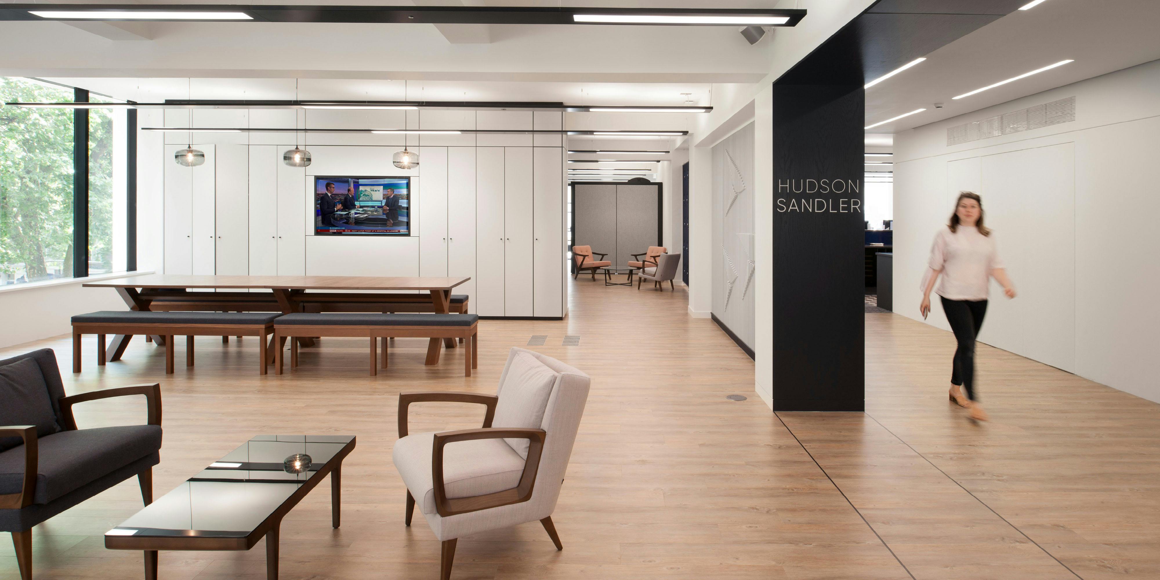
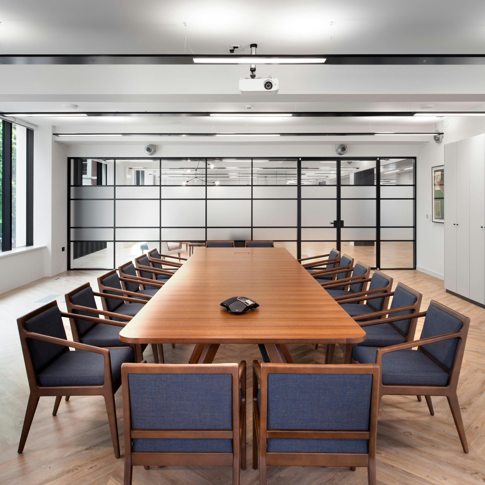
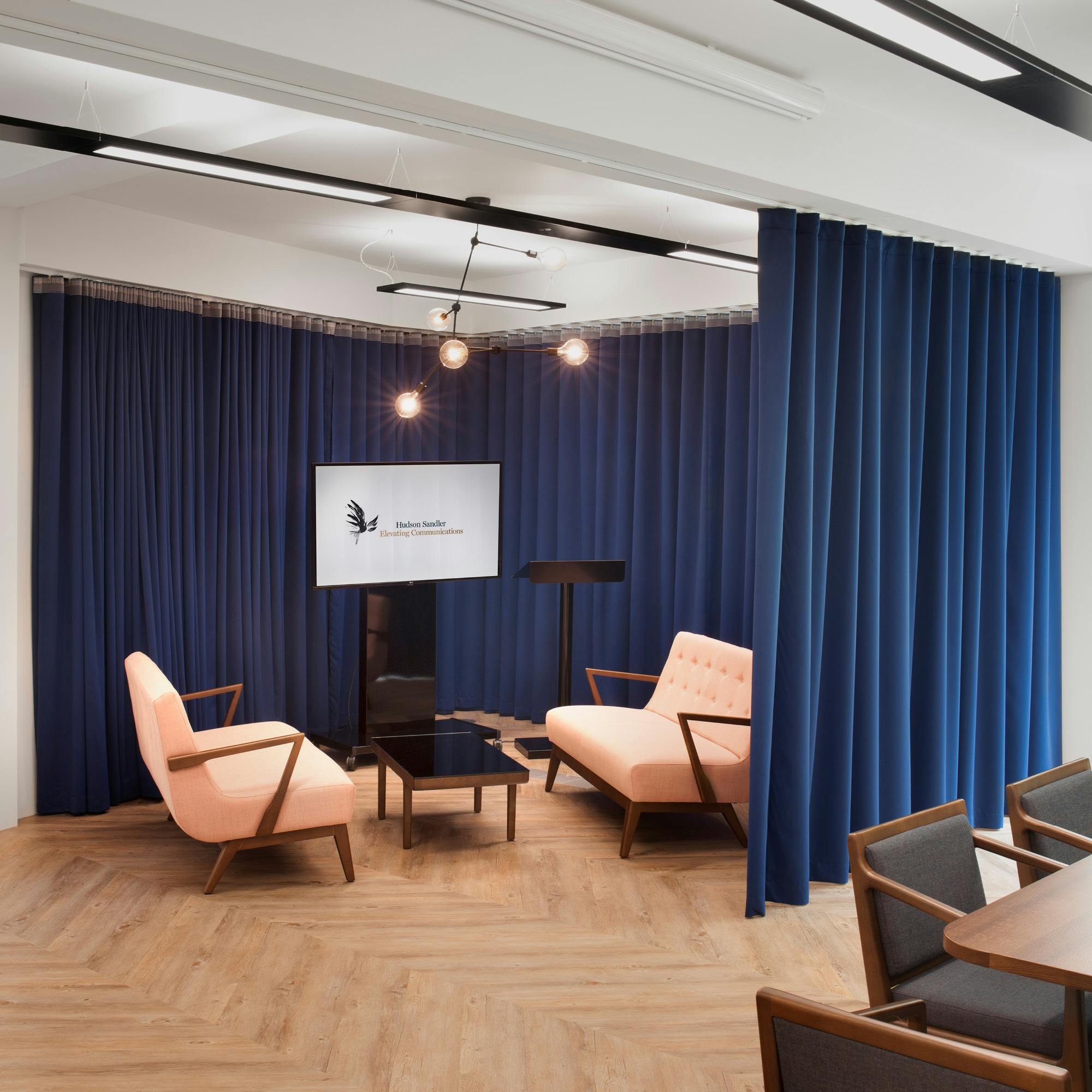
The office arrivals space eschews the tradition of a reception desk and instead comprises a centralised hub with comfortable lounge seating for visitors, and an oversized bench table for hot desking and informal meals. Accessed from the hub is a large presentation space that can be adapted to suit whatever event is taking place, whether it be a boardroom presentation, a reception or screening, or an informal meeting. A large curtain creates a backdrop for a drop-down presentation screen, and when the curtain is drawn back the space is maximised.
